Be Mobile physiotherapy logo in white

Exercising the over 50's

When an offline Physio goes online, learn how we helped them go from helping hundreds to helping hundreds of thousands.

A Be Mobile 'Tutorial Hub,' a digital product providing exercise tutorials is displayed on two smartphones. The left phone displays the product's menu with options like 'Why exercise matters' and 'Managing conditions.' The right phone shows video thumbnails. On the left side is a branded colour pallet. In the foreground, a senior woman lifts dumbbells with assistance from a younger trainer.

Bemobilephysio.com.au

Mitch and the physio team bring a fun and fresh approach to exercise in Sydney, Australia. But with a new mission: to help those over 55+ get stronger and feel more confident worldwide.

THE IDEA:

Redefine the Bemobileohysio brand to speak to the over 55's and take their Kajabi platform to the next level. Easy to sign up, personalised and fun to learn.

BRAND MOTIVATED:

We designed a fun new Dashboard (and a website too!) that makes it easier than ever to exercise online. Using the Kajabi platform, the Motivation team developed a personalised experience so that hundreds of thousands of members can work out anywhere, Anytime. Any place.

 TECHNOLOGY:

Launchpad logo in black
Kajabi logo in black
Cloudflare logo in black

Funnel Design

Post-Discovery we created a simple Acquisition funnel into the free product and Dashboard.

Custom Checkouts

We designed custom checkouts with a currency selection option

Custom Designs

We designed & developed a powerful custom library & Dashboard for multiple membership levels.

THE RESULT

Be Mobile Physiotherapy logo in white

Strength and fitness for adults 55+


Our objective was to develop a clean and user-friendly website specifically designed to cater to individuals aged 50 and above. We aimed to create a visually uncluttered interface that is easy to navigate, ensuring a seamless and intuitive user experience
Branding & Stylesheet

The LaunchPAD Stylesheet is a crucial page in our custom website theme. It serves as a centralized hub for all branding designs and information, ensuring consistency across every page on LaunchPAD.
 
This Stylesheet empowers us to swiftly modify the entire website's branding colors or fonts within minutes. Once updated on the Stylesheet, these changes automatically propagate to all connected pages.
 
Its power lies not only in its ability to control branding elements but also in its capacity to unleash limitless design possibilities. Every button and card can be meticulously crafted to perfection using the various design settings available. We all know that the finishing touches make a difference.
 
Working with this client allowed us to explore diverse button designs and ideas, greatly influencing the distribution of primary colours throughout the website.


Homepage

The Motivation team has created a stunning new homepage for this brand. Our pages are always optimised for any device and tested on different browsers. Our goal is to create visually appealing pages that tell a captivating story and drive conversions.
 
Our client wanted to enhance the user experience and provide the best possible journey on their website, starting from the homepage. The new design perfectly captures the essence of the business and promotes the supportive community at its core. Our objective was to convey this from the very first touchpoint, the homepage, and create a seamless experience that guides leads into becoming members.
 
As we know, a brand's homepage is the initial impression of a website. That's why we focus on designing a clear structure that highlights the value proposition and provides a strong call to action. We incorporated interactive tools, optimised images for fast loading, and crafted compelling copy that resonates with the target audience. Combined with our bespoke LaunchPAD software, we delivered an exceptional and unique Kajabi homepage.

Public pages

We developed multiple public pages, including the homepage, for this project. This is crucial for SEO and audience engagement. We created an About page, Story, and Contact.
 
To enhance the user experience and drive audience engagement, we incorporated all public pages into the LaunchPAD website theme. By doing so, we guide users through the Acquisition funnel seamlessly. Our software allows us to load these pages directly within the Dashboard, eliminating the need for opening a new tab. This greatly improves the user experience, especially for mobile users.
 
To create highly effective pages, we utilise various bespoke sections from LaunchPAD, such as timelines, UX blocks, and CTA permissions. These sections are designed to adapt to whether a visitor is logged in or not, maximising conversion rates.


Acquisition Funnel

The Acquisition Funnel is a crucial sign-up strategy that many of our clients rely on. It has consistently demonstrated its effectiveness in converting leads. This two-step process provides a seamless journey, removing any barriers to entry. With the implementation of key tactics through our LaunchPAD software, such as name and email auto-population, we prioritize the user experience above all else.
 
In this specific project, our client had a large audience but wanted to establish a genuine connection with their followers and demonstrate the value of their products. The Acquisition Funnel was the perfect solution for converting these individuals into free members, allowing them to experience the exceptional service and community offered by Be Mobile. Within hours of launching the new platform, we witnessed an astounding influx of new sign-ups, once again confirming the efficacy of our sign-up method.

We value your privacy

At Motivation, we take consent seriously. We prioritize compliance with regulations and work closely with legal experts to stay up-to-date with the latest changes.
 
Our Consent service includes a Cookie popup tool and a custom Legal hub. Unlike Kajabi's standard build, we offer a Sidebar feature that enhances user experience. With LaunchPAD, we can create the most effective solution for users, even in terms of legal requirements.
 
Be Mobile was eager to opt for our service because our Consent covers not only UK and EU laws, but also those in the USA and Australia. We customise the solution based on the customer's specific needs and operating location. Our Consent is fully branded to match each business while maintaining the overall platform's appearance and ensuring compliance with all legal procedures.
 
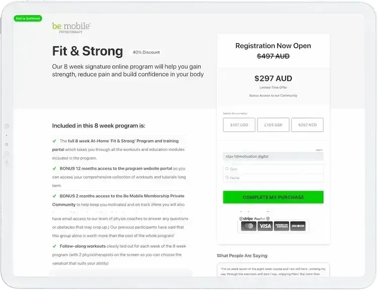
Be Mobile's 'Fit & Strong' program checkout page.

Custom Checkouts

Custom Checkouts are highly sought after by Kajabi users. The LaunchPAD custom checkouts have been meticulously refined and optimized to provide stunning designs and seamless user experiences. Our team goes above and beyond, investing countless hours in developing effective strategies and conducting thorough testing to ensure that our checkouts not only look great but also serve as powerful conversion tools.
 
For this particular project, we recognised the importance of utilising Custom checkouts as they seamlessly integrated with the entire platform. Additionally, we leveraged our currency feature, allowing members to effortlessly switch between different currencies directly from the checkout page. Furthermore, the software integrates with the LaunchPAD Dashboard perfectly, enabling users to navigate between the two interfaces with ease.

Multi-Currency Pricing Plans

The Pricing page on the LaunchPAD website theme is a highly sophisticated and innovative feature. It introduces unique functionalities that have never been seen before on Kajabi.
 
With this page, users can create an unlimited number of plans and easily switch between yearly and monthly options. Additionally, there are currency buttons available to cater to different regions, along with multiple CTAs, based on user permissions.
 
Our team not only focuses on building a functional and user-friendly pricing system but also ensures seamless upgrade and downgrade funnels by implementing appropriate tags and automations.
 
One particularly interesting aspect of our work with Be Mobile was the ability to offer their products in four different currencies. To accommodate this, we developed user-friendly buttons, each linked to a specific price and checkout option. This, combined with our custom checkouts, guarantees an impeccable user experience, all within the Kajabi platform.
 

Launchpad Design Optimised

The BeMobile website was intentionally developed to have a flexible design that adapts seamlessly to various screen sizes and browser software, unlike Kajabi which struggles in this aspect.

Launchpad allowed us to overcome those challenges. The result is a BeMobile website that is optimised for mobile devices, tablets, laptops, desktops, and large screens. Additionally, we prioritised faster loading times and strategically sized all assets to enhance SEO effectiveness and provide an engaging experience across mobile and desktop platforms.

A fitness adults website by Be Mobile is shown on three screens, including a desktop, tablet, and mobile phone, showcasing the screen-optimized design.

Kajabi Membership Dashboard

The Dashboard is an essential part of the LaunchPAD website theme. We upgraded from the standard Kajabi Library a few years ago, creating a more advanced member-platform. The Dashboard has endless capabilities, using cards, links, popups, and loading everything within itself instead of redirecting members to another tab.
 
The Be Mobile Dashboard was complex, as we customised it for four different segments and introduced new Dashboard pages that had never been used before. Its overall appearance was truly impressive, and its efficiency was astounding.
 
Dashboard UX Video 
 
One of the standout features on Be Mobile's dashboard was the UX video block. This dynamic block consisted of two buttons, each unveiling a distinct video upon clicking. It elevated the concept of the Welcome video by not only greeting users but also guiding them to their next steps, all within a single section.
 
The UX video block went beyond mere interactivity; it encapsulated the very essence of the enhanced and modernised platform.
 
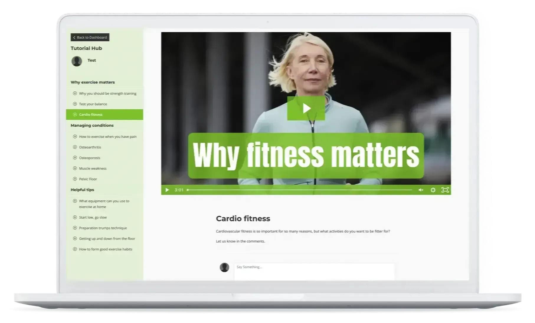
A laptop screen displays the Be Mobile 'Tutorial Hub' in a neatly organized form and design. On the left is a menu, and on the centre, there's a video with a play button featuring a confident woman and the message 'Why fitness matters' in the thumbnail. Under the video is a comments section.

Meteor Product Themes

When discussing a project on Kajabi, it is essential to highlight the products. Our team has created a unique product theme called Meteor. It boasts a versatile sidebar, tabs, the ability to add favourites, and customisable design options.
 
We implemented Meteor into the Be Mobile products, further enhancing the user experience. Its seamless integration with the platform's branding and the sidebar's navigation, reminiscent of the Dashboard, made it the ideal finishing touch for an exceptional platform that prioritises its members.

Personalised Experience

Another crucial aspect of our project was the creation of a customised user experience and the incorporation of gamification elements.
 
To achieve this, we introduced a "status" feature that directly connected to each member, providing them with real-time updates on their current title/status within the platform. This allowed them to track their progress and see how far they had advanced.
 
Additionally, we developed a dedicated "Steps" page that seamlessly synchronized with the member's progress. This page presented the completed steps in a step-by-step format, clearly indicating which steps were finished and what the next step entailed. To enhance visual appeal and clarity, we utilised cards with distinct colours and icons.
 
The 'Be Mobile' share feature is displayed on the mobile screen.

Share Feature

The Share feature was a specific addition to the Be Mobile project. The client desired an easy way for their members to share the platform with others. To fulfil this request, we created the Share feature with a single button. Sharing the platform now only takes seconds.

WEB PROJECTS

Some of our favourite web design projects 

Qina logo in black

Delivering the future of health

○ Product Development 
○ Digital Strategy
○ SEO Marketing
A concept for personalized nutrition technology. On the left, there's a plate with food items arranged in the shape of the letters 'DNA' next to a fork and knife. Above the plate is the branded colour palette. On the right, a smartphone displays Qina's website. Below, icons and names of companies like 'DNAfit,' 'Genopalate,' 'Lifenome,' and 'biolinq' are shown.
Dream Body Club logo in black

Bringing Exercise to the world

○ Digital Strategy
○ Membership automation
○ Web & product design
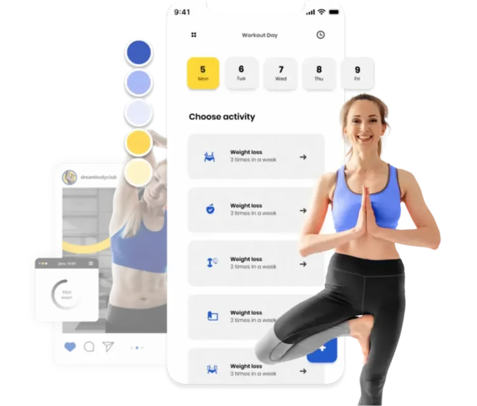
Two smartphones and a woman doing yoga. The left phone shows a social media post from 'dreambodyclub' with a woman exercising and a calorie count. Next to it is the branded colour palette. The right phone displays the website interface with a calendar marked 'Workout Day' and options to 'Choose activity'.

Testimonials

MOTIVATE YOUR BRAND

Motivation Digital colour icon & white text footer logo

We design, launch & scale automated Kajabi websites & marketing funnels.

Motivation Digital Ltd a member of the Motivation Group Ltd. Reg No. 10105398.

Group VAT Registration: GB 284 6168 72

Orion House, 5 Upper St. Martin's Lane, London, England, WC2H 9EA

Copyright © 2008 - 2024  |  Motivation Group Ltd. All Rights Reserved.